UX/UI DESIGN
Welkom-U Dashboard
Helping immigrants settle seamlessly, with the tools, guidance, and community they need.
www.welkom-u.caContext
Relocating to a new country can be overwhelming. As someone who relocated from Lagos, Nigeria to Kigali, Rwanda, I personally experienced the culture shock and the struggle of settling in. This inspired the creation of Welkom-U, a web-based PWA that supports people moving to Canada by giving them access to housing, social connections, cultural information, and other essential resources.
Introducing Welkom-U
Problem:
When I moved from Lagos to Kigali in 2018, I found it difficult to access reliable, local information. Finding housing, understanding the job market, and adjusting to a new culture were major challenges during my first few months.
What I did:
I designed Welkom-U, a digital platform to help immigrants prepare for relocation and settle in more easily. I spoke to others with similar experiences to identify common pain points and prioritised features that addressed their real needs.
Outcome:
The tool provides verified housing listings, job opportunities, cultural tips, and ways to connect with local communities, all in one place. It's designed from the perspective of someone who's been through the process, with a focus on clarity, trust, and practical support.
Design Process
~9 Weeks to Idea Validation
Synthesising the Problem
I created empathy maps to synthesise user feedback and identify key needs, including access to accommodation, job opportunities, and a sense of community and belonging.
Talking to Users
I interviewed 14 users who had recently migrated to Canada and other countries to understand their experiences, challenges, and key pain points during relocation.
Analysing Discovery
I reframed the problems into opportunities using the "How Might We" framework. This helped the team explore solutions more effectively and align around a shared understanding of the challenge.
Designing the Experience
I mapped out user flows and journeys, then created quick sketches to test key interactions early. This allowed us to refine the user experience before progressing to high-fidelity interface designs for the web app.
Research
I interviewed 14 newcomers to Canada and the UK to uncover needs, fears, and barriers.
What the users are saying
Exploring Opportunities
I used the "How Might We" framework to turn user challenges into design opportunities. This helped me generate solution ideas grounded in real user insights and ensure the approach stayed focused on their needs.
How Might We

Competitor Analysis
I conducted a competitive review of similar products in Canada that support immigrants, identifying their strengths, gaps, and areas for improvement to inform the design of a more user-centred solution.
What others are doing?

Challenges and Learning
This project was my first opportunity to design for people relocating across countries. To better understand the needs of immigrants, I explored how relocation and immigration support apps work and gathered key insights from two primary sources.
UX Collective Article"Making the move abroad less difficult — a UX case study" by Paul Naylor
- 1.I gained an understanding of the complex bureaucratic processes and paperwork involved in relocating to a new country.
- 2.People need access to as much reliable information as possible about their new country to navigate the transition smoothly.
- 3.People relocating to a foreign country need to connect with individuals who understand the local systems and bureaucratic processes to help them settle more easily.
UX Magazine"Onboarding: best move for user retention in mobile apps"
- 1.Users should be able to quickly understand the purpose of a page without confusion or delay.
- 2.Use clear, straightforward language that's easy for users to understand.
User Flow
This user flow reflects the thinking and decisions made during the design process.

Wireframes
I created initial sketches to explore and visualise design ideas.

Design Iteration
I tested several iterations of the homepage to ensure users could quickly find the information they need to make informed decisions, while also improving the visual appeal of the content feed.

Feedbacks & Fixes
Based on testing and feedback, I identified the need to improve the search functionality, refine the card layout and arrangement, adjust the scroll icon, and enhance the side navigation for better usability.
Previous Iteration

Current Iteration

- Most users didn't realise
the cards were clickable. - I also found that the cards contained too much information, all crowded in the same area, which made them harder to scan and engage with.

- I kept the same width and icon as the previous card but increased the height to create better visual balance. This adjustment allowed for improved icon placement and added subtle background patterns for a more polished look.
- I positioned the text next to the call-to-action (CTA) to make it clear to users that it is interactive and clickable.


High Fidelity Design
Accommodation Info - I added location-specific accommodation details to ensure search results are relevant to the user's destination country.
Utilities Filter – This feature allows users to narrow down accommodation options based on their specific needs, such as available amenities.
Search Criteria – Users can select their preferred location, accommodation type, and set a budget to tailor the results to their preferences..
Apartment Info – Key details such as rental price and important features are highlighted to give users the essential information at a glance.
Detailed Information –Additional context is provided to help users make well-informed decisions about the apartment.
Map – An integrated map helps users understand the exact location of the property and explore the surrounding area.
Top Activities – Highlights indoor and outdoor activities available in the selected location, helping users engage with their new surroundings.


Developer Handoff
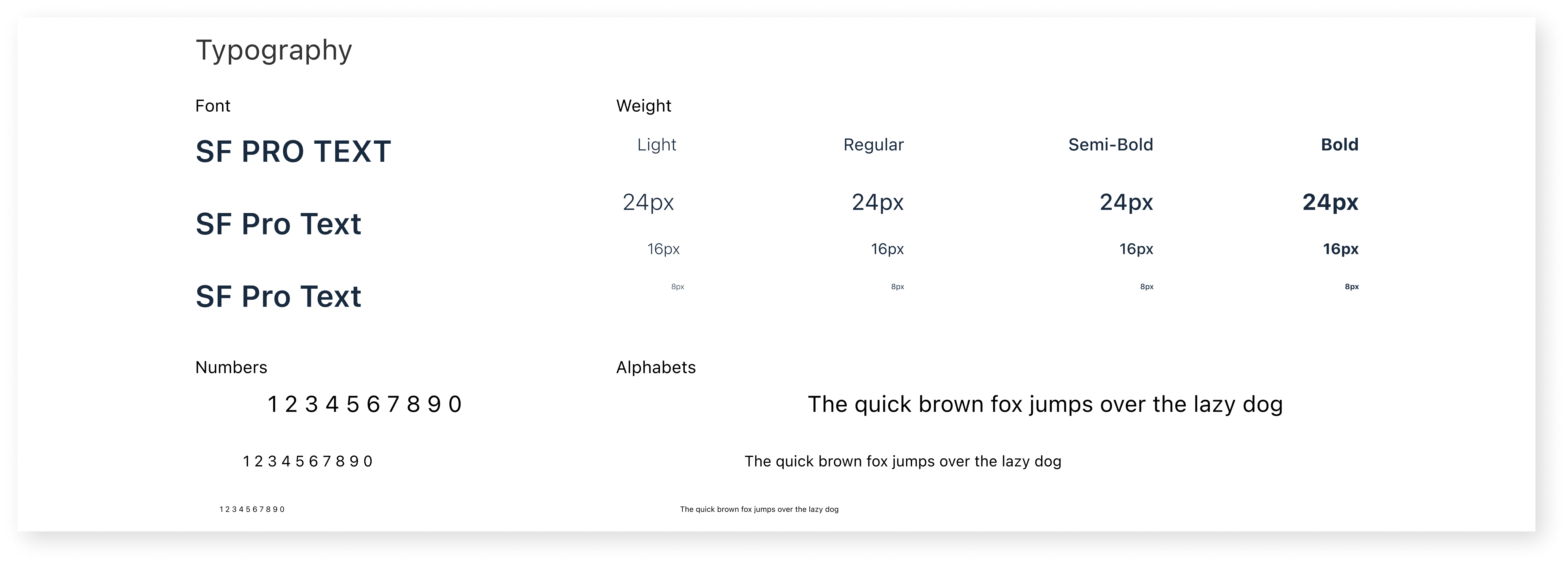
To conclude the project, I took the extra step of consolidating all design components into a structured design system. This provided consistency and made it easier for the development team to implement and maintain the product over time. I facilitated the design handoff using Zeplin to ensure smooth collaboration and accurate execution.
GRID: The layout uses a 12-column grid system to ensure consistent spacing and alignment across the design.
ICONS: Some of the icons used in this project were sourced from Remix Icon, an open-source React icon library. All icons are sized at 24px by 24px for visual consistency.